When I was studying for my ordination exams in the PCA, one field of study which took up much of my time was the history of Presbyterianism in America. I used several different resources, but one of the most helpful was a graph I came upon that tries it’s best to depict the several different presbyterian denominations, and how they relate to one another over history. This is the diagram:
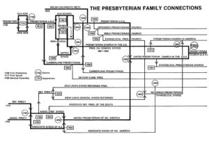
Recently, there have been a few different attempts to represent the same information via an updated graph. Admittedly, the older graph isn’t the easiest thing to look at! I decided, with some inspiration from a fellow PCA pastor, to go ahead and remake the older graph, but using the design of the London Underground rail system. I’ll post it below for anyone who could benefit from it: